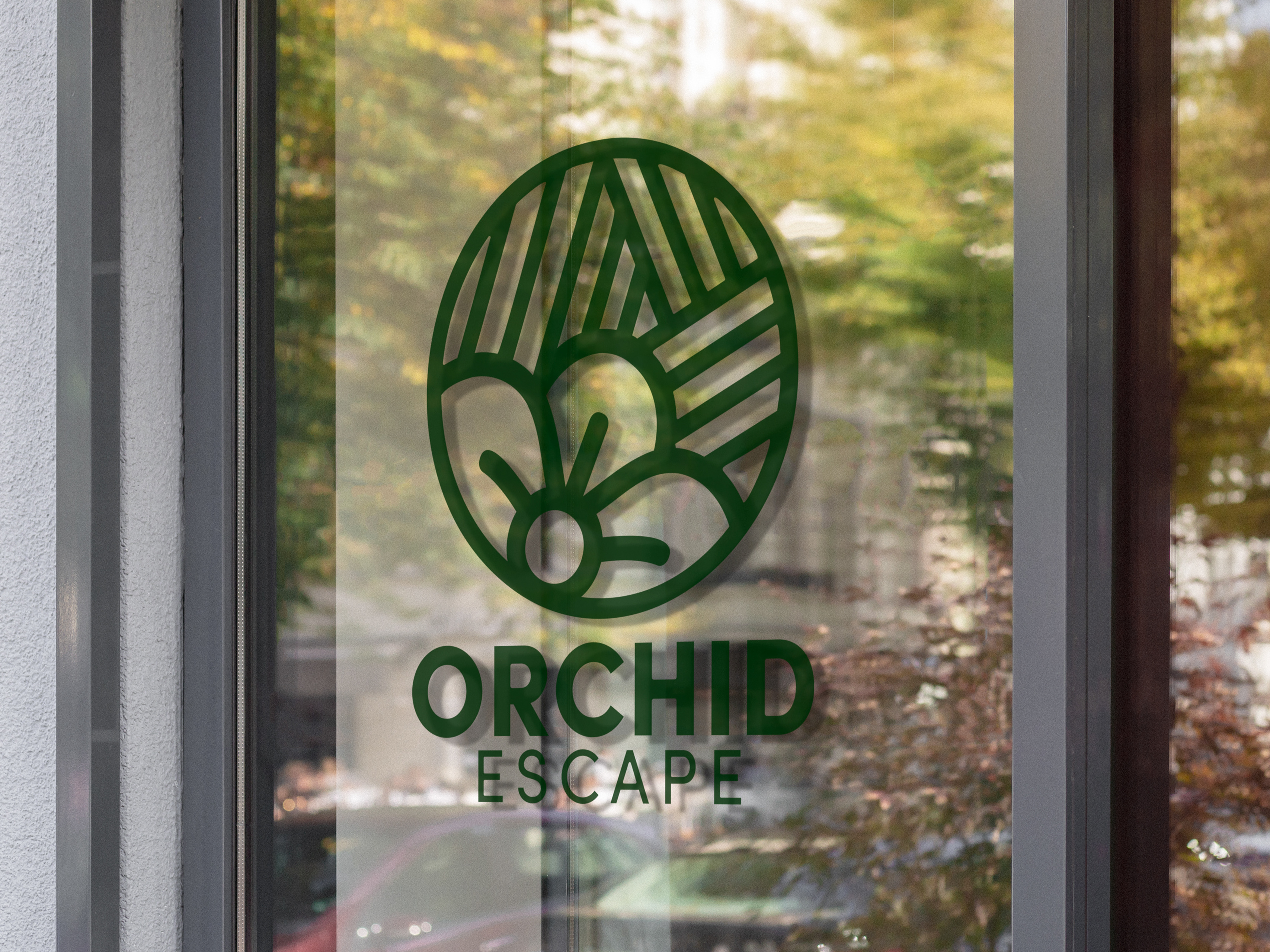
This project constituted a comprehensive redesign initiative for Good Harvest Market, a company seeking to enhance its visual identity. The primary objective was to elevate the logo beyond its original depiction of a flower. In pursuit of this, I strategically integrated the distinctive architectural feature of the company's building, characterized by three prominent windows at the front. This deliberate choice aimed to impart a more nuanced and representative symbol for the brand. Moreover, the redesigned logo incorporates elements symbolizing the geographic context of Wisconsin, where the company is situated. By integrating hills and fields into the logo, a subtle yet impactful nod to the Wisconsin landscape was achieved.
SKILLS: Typography // Balance and Composition // Conceptualization // Mockups
SOFTWARE: Illustrations // Photoshop
SOFTWARE: Illustrations // Photoshop
